

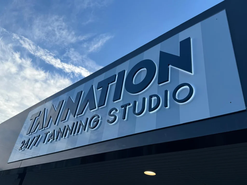
Grandview manufactured two coordinated sets of backlit channel letters for TAN NATION: a two-line storefront sign and an interior display built around a circular arrangement of individual letters. Both use dark letter faces with white backlighting, while the interior set adds blue lettering and a white illuminated script.
The project brings the same distinctive wordmark into two different settings. Across the storefront, it reads as a horizontal name above “24/7 TANNING STUDIO.” Inside, the letters turn around the central “24 HOUR TANNING” and “Southport” text, creating a separate feature without introducing a different brand identity.
Dark Letter Faces with White Backlighting
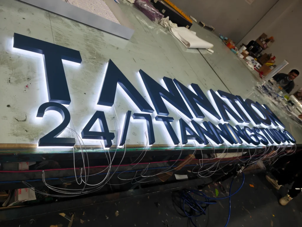
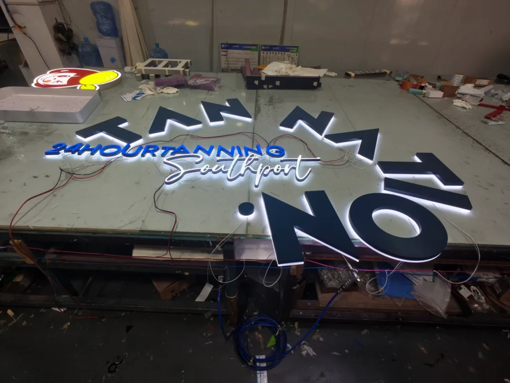
The main TAN NATION letters combine opaque dark faces, dimensional side returns and an illuminated rear section. The front surfaces retain their solid appearance while white light emerges around the back edges. This separates the letter shape from the light surrounding it.
The rear section is an important part of the construction. It follows the outline of each character, including the open centre of the O and the angular cuts in the A. The illumination therefore traces the custom lettering rather than forming a rectangular lightbox behind the name.
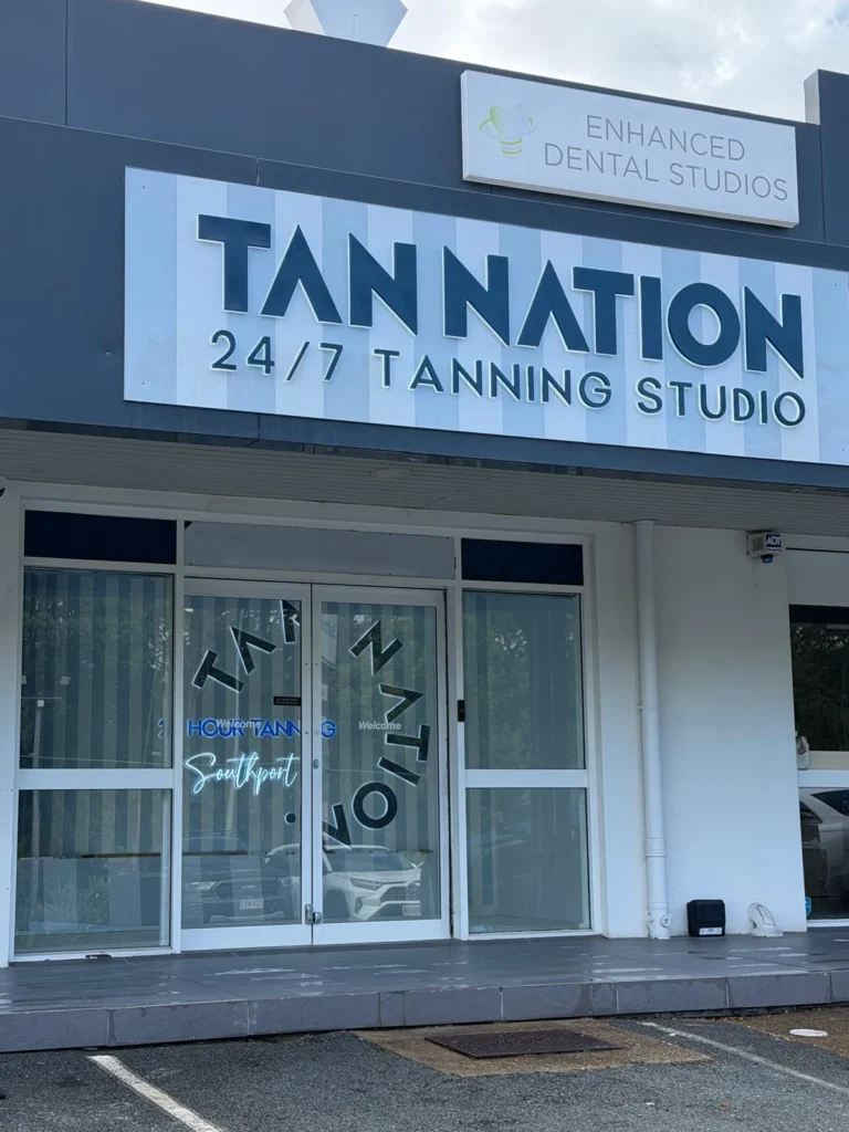
On the storefront, the white light falls onto the pale sign panel around the letters. The resulting halo sits outside the dark faces, leaving the large wordmark visually distinct from its background. The smaller lettering below follows the same dark-face and white-backlight treatment.
Grandview produced the lettering as individual three-dimensional components. Each character has its own body and electrical lead, allowing the large brand letters and smaller descriptive text to be arranged as separate rows. The factory lighting stage brought these components together before their installation at the shop.
One Wordmark in Two Different Layouts
The exterior sign uses a broad horizontal composition. TAN NATION occupies the upper line, with the smaller “24/7 TANNING STUDIO” wording beneath it. The custom angular letterforms give the name its character; the simpler lower line provides the business description.
Although both lines share the same lighting treatment, their different sizes establish a clear hierarchy. The storefront name remains the main element, while the lower line sits within the width of the larger lettering.
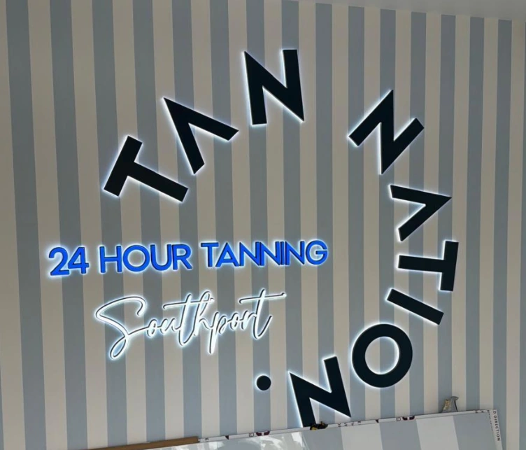
The interior arrangement changes the relationship between those same individual characters. Instead of sitting on one baseline, the TAN NATION letters rotate around the central wording. Their separate construction accommodates these changes in position and orientation while retaining the shapes used on the exterior.
The striped backgrounds also connect the two settings visually. The horizontal storefront sign and the interior wall composition have different proportions, but the dark lettering, white backlighting and pale vertical stripes provide a common visual language.
Block Letters, Blue Text and Illuminated Script
The interior set combines three distinct lettering treatments. Large dark-faced characters form the outer arrangement. Blue “24 HOUR TANNING” lettering crosses the middle, while “Southport” appears below in a flowing white illuminated script.
Together, the two sets show how Grandview’s custom channel letters can carry one identity across a building frontage and an interior feature, with the lettering layout and supporting text adapted to each setting.
Contact Grandview to discuss backlit channel letters for your storefront or interior branding.