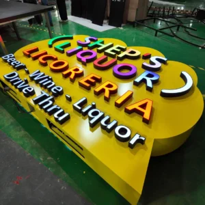

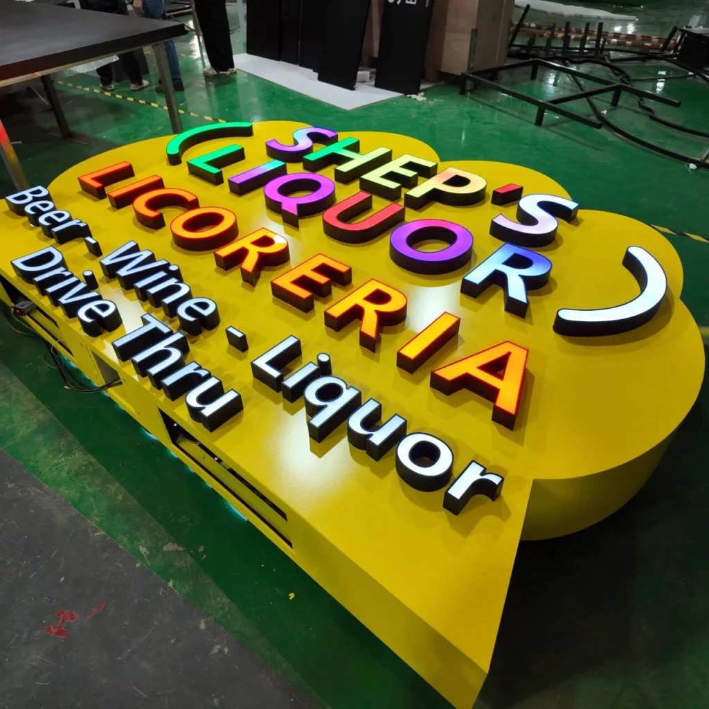
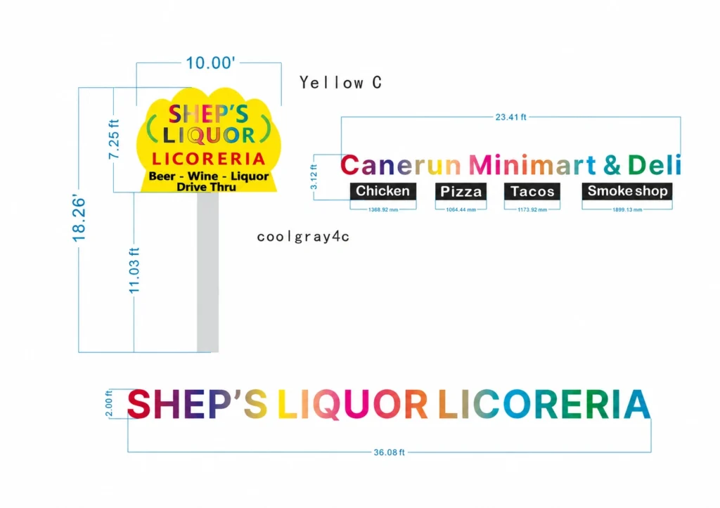
Grandview fabricated the cabinet and illuminated lettering for this SHEP’S Liquor pylon sign. The assembly combines a yellow cabinet with a curved outline, raised letters with black returns, and several groups of face-lit text. The main SHEP’S LIQUOR lettering carries a multicolor lighting effect, with red LICORERIA lettering and smaller white service lettering below.
A Custom-Shaped Yellow Cabinet
The cabinet has a series of rounded sections across its upper edge and a broad face that holds the lettering. Its outline extends around the text rather than enclosing it in a rectangular box. The yellow finish continues across the front and outer cabinet sides.
Individual letters sit proud of the cabinet face. This creates two distinct construction layers: the shaped cabinet behind and the separate letter bodies in front. The cabinet provides a common mounting surface for the large brand name, curved symbols, and smaller lettering.
| Component | Construction |
|---|---|
| Main cabinet | Shaped body with a yellow face and outer sides |
| Brand lettering | Separate three-dimensional letters with illuminated faces and black returns |
| Curved symbols | Raised, illuminated elements positioned beside LIQUOR |
| Service lettering | Smaller individual face-lit letters mounted below the brand name |
Face-Lit Letters with Black Returns
Each letter has a front face and a surrounding return that forms its depth. The black returns follow the letter contours, including the inner openings of letters such as Q, O, and R. Narrow dark borders also frame the illuminated faces.
The front faces carry the light, while the letter sides retain their dark finish. Grandview used this construction across both the main lettering and the smaller text, giving the different sizes a consistent edge treatment.
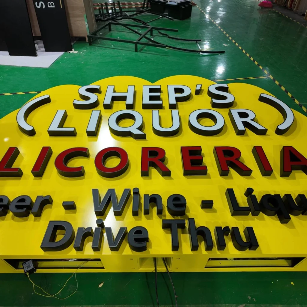
The two curved elements beside LIQUOR are separate raised components. They follow the same face-lit construction as the letters, carrying the logo’s rounded shapes into the assembled sign. This project brings those components together on one cabinet rather than using a flat printed logo panel.
Multicolor Branding and White Service Lettering
The SHEP’S LIQUOR letter faces display several colors, including transitions within individual letters. Beneath them, LICORERIA forms a separate line of red illuminated text.
The lower lettering spells out “Beer – Wine – Liquor” and “Drive Thru” in white light. These smaller letters are also individually formed and mounted, continuing the dimensional construction through the service information.
Together, the cabinet, large letters, curved symbols, and smaller text form the fabricated sign head. The project’s defining detail is this combination of a shaped background and separate illuminated components, assembled and powered on in Grandview’s factory.
For a similar project, explore our custom pylon signs or contact us for a quote.