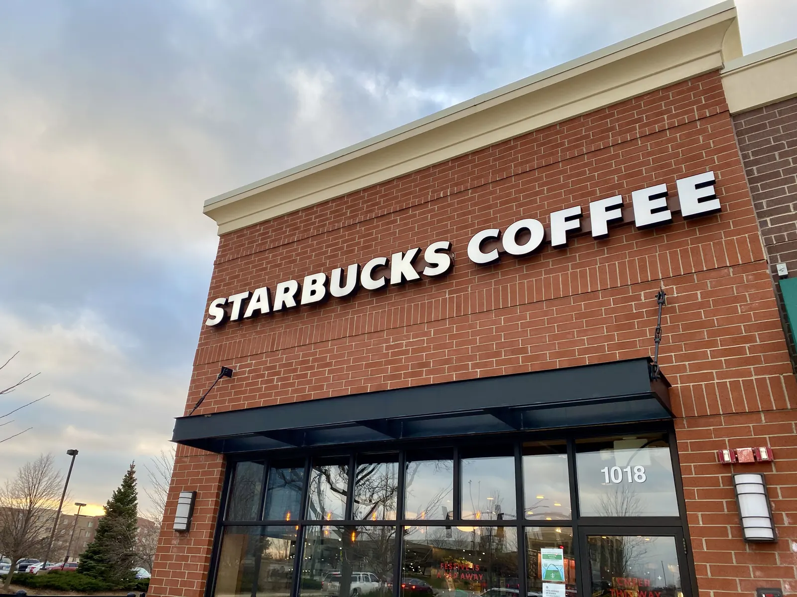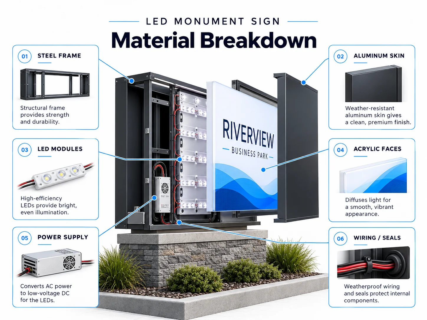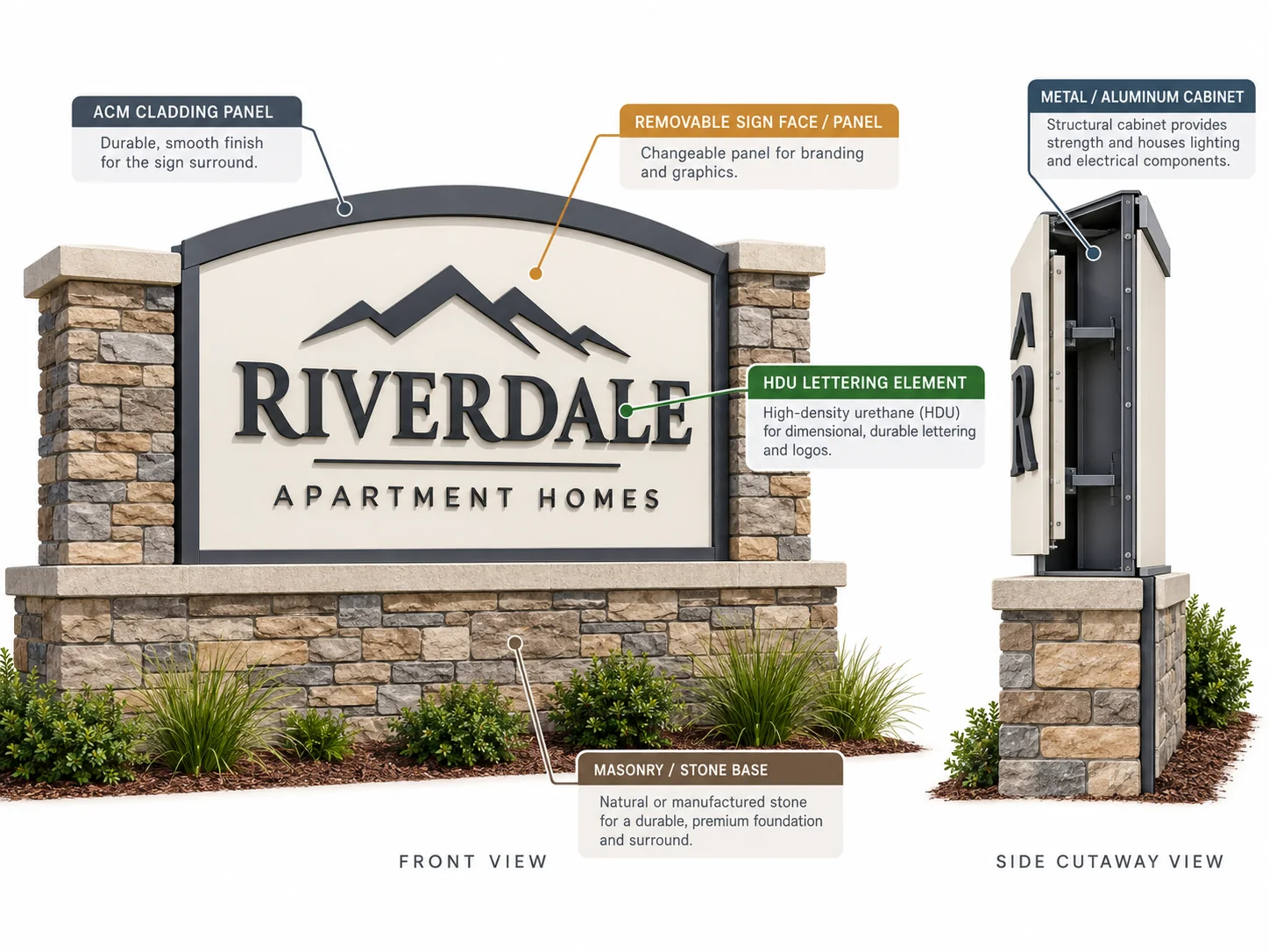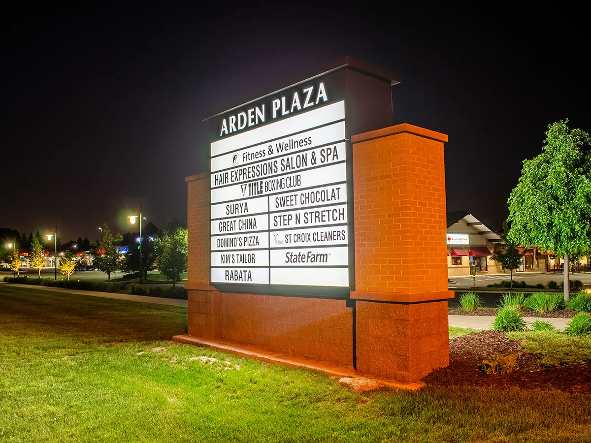


When choosing storefront signs, do not start with the sign type. Start with the storefront.
Channel letters, cabinet signs, and dimensional letters can all work well. However, each one fits a different type of project. The right choice depends on how people see the building, how much information the sign must show, whether it needs lighting, and what the wall can support.

Start With the Storefront
A sign may look good on a design file but feel very different once it is on the building.
So, before choosing a sign type, look at the real site.
Ask a few simple questions:
- Will most people see the sign while walking or driving?
- Does the sign need to be clear at night?
- Is the brand name short and simple?
- Does the logo have many shapes, colors, or words?
- Is there enough clean wall space for the sign?
These points can quickly rule out poor options.
For example, a simple brand name may work well as individual letters. By contrast, a detailed logo with extra text may be easier to keep together on one sign face.
Channel Letters vs Cabinet Signs vs Dimensional Letters
This table gives a quick starting point. It is not a fixed rule because every storefront is different.
| Project Condition | Channel Letters | Cabinet Sign | Dimensional Letters |
|---|---|---|---|
| Night visibility is important | Strong fit | Strong fit | Needs other lighting |
| Short brand name | Strong fit | Works | Strong fit |
| Complex logo or more text | Can look busy | Often a better fit | Less flexible |
| Clean, simple facade | Strong fit | Larger visual block | Strong fit |
| Internal lighting not needed | Usually not needed | Usually not needed | Strong fit |
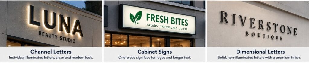
Channel letters are a good choice when the business name should stand out as separate letters. They also work well when night visibility is important.
For more detail, see Grandview’s guide to LED channel letters for storefront signs.
Cabinet signs use one main sign body and face. Because of this, they can handle longer names, logos, and extra information more easily. They can also keep a complex design in one clean layout.
Dimensional letters are simpler. They are often a good fit when internal lighting is not needed or when the building already has enough outside lighting.
You can learn more about material and depth choices in Grandview’s guide to exterior dimensional letters.
Think About How People See the Sign

Viewing conditions matter more than many buyers expect.
A storefront facing a road has different needs from a shop inside a walkable retail area. For instance, drivers have less time to read a sign. Therefore, the name must be clear from farther away and easier to understand at a glance.
A shop seen mainly by pedestrians can often use smaller details because people are closer to the building.
Night conditions also matter. A sign that looks clear during the day may lose contrast after dark. As a result, lighting may change which sign type makes the most sense.
For wider facade planning, see Grandview’s commercial building signs guide.
Let the Building Rule Out Bad Options
Sometimes the preferred design is not the best choice for the wall.
For example, the wall surface, wiring access, sign-band depth, and landlord rules may affect how the sign can be mounted. In some projects, these limits can change the sign type before production even starts.
Local sign rules are also different from one area to another. The International Sign Association notes that sign permits and review requirements can vary by community.
Because of this, local permit, structural, electrical, and installation requirements should be checked by local project professionals before fabrication is final.
For channel letter mounting details, see Grandview’s custom channel letter fabrication guide.
A Simple Way to Choose
Start with three questions:
- How will people see the storefront during the day and at night?
- How simple or complex is the brand design?
- What can the building and local project conditions support?
If you need clean, illuminated individual letters, start with channel letters.
If you need one panel for a longer message or complex logo, start with a cabinet sign.
If lighting is less important and you want a simpler look, dimensional letters may be the better fit.
FAQ
Are channel letters always the best storefront signs?
No. They work well for many retail projects, but cabinet signs and dimensional letters can be better for some logos, walls, or lighting needs.
Do storefront signs always need lighting?
No. It depends on the business hours, nearby lighting, viewing conditions, and how important night visibility is.
Conclusion
The best storefront sign usually comes from the building and viewing conditions first. Once those are clear, the right sign type becomes much easier to choose.
References / Further Reading
International Sign Association — Sign Permit Guidance