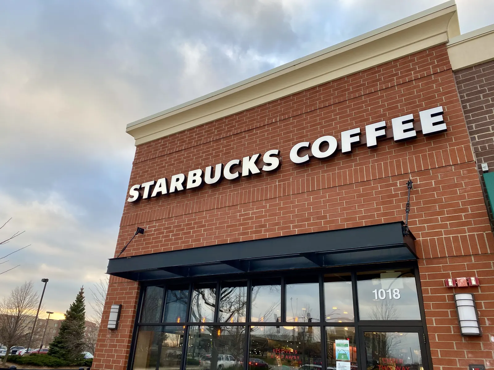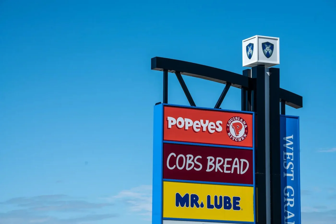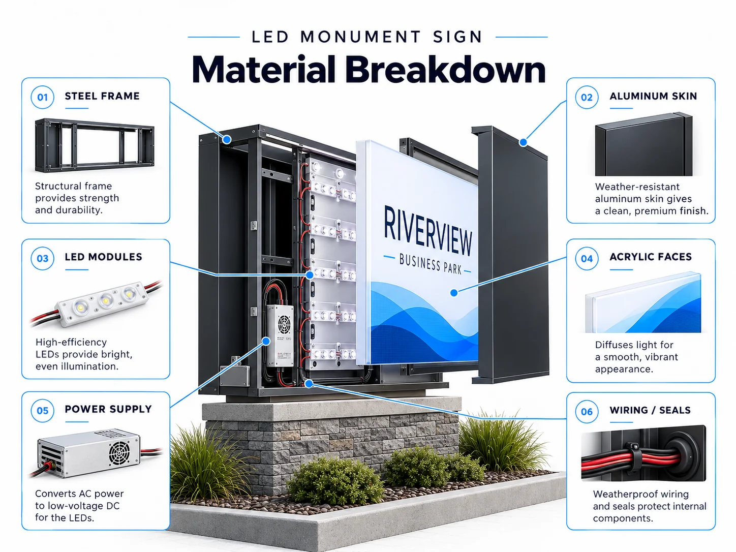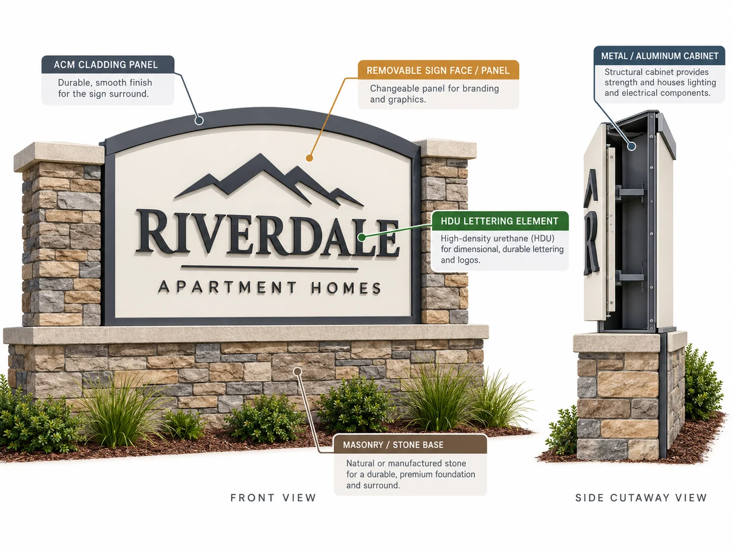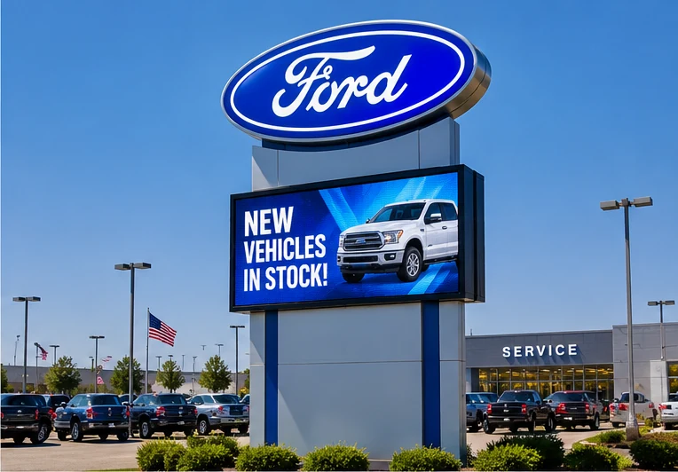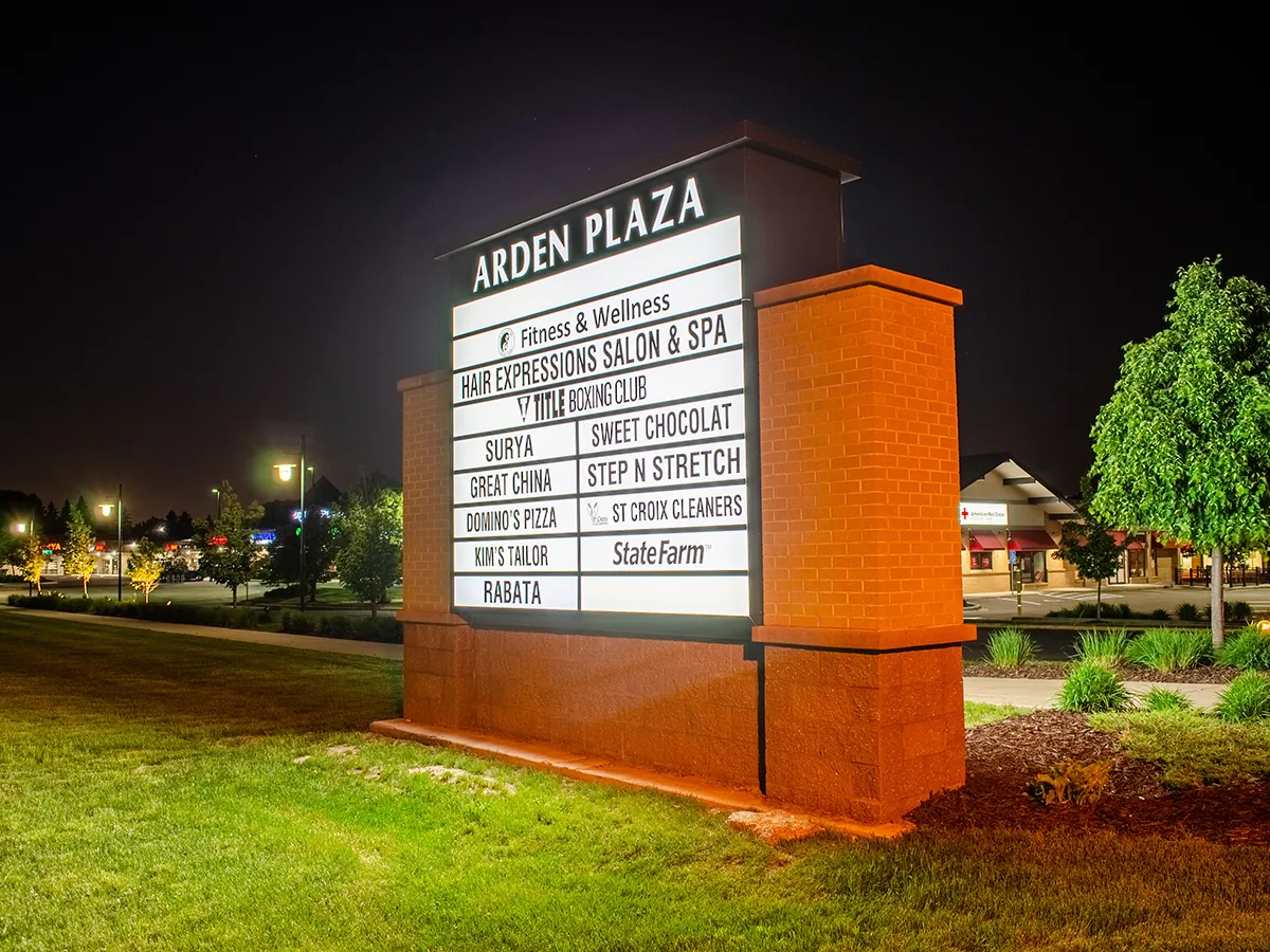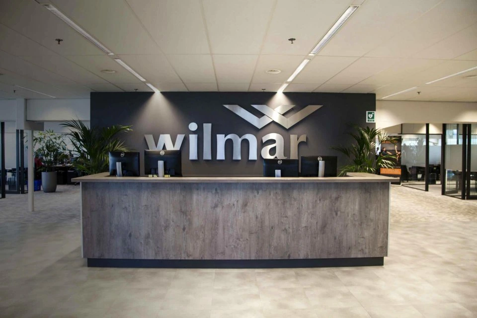


In short: a store front logo should not simply be enlarged from the original artwork and sent to production. The logo geometry, available storefront size, viewing distance, lighting method, and mounting conditions all affect how it should be physically built.
Simple wordmarks may work well as individual letters, while logos with fine details, icons, or tightly spaced elements may need a different construction approach. The goal is to keep the brand recognizable while making the sign practical to fabricate, illuminate, and install.

Start With the Logo Geometry, Not the Sign Type
Before choosing channel letters, dimensional letters, or an integrated logo panel, look at how the logo is actually drawn.
A simple wordmark with clearly separated letters usually gives the fabricator more options. A logo with a symbol, narrow lines, small secondary text, or tightly enclosed spaces may need a different construction approach.
This does not mean redesigning the brand. It means identifying which elements must remain visually exact and which fabrication details need adjustment so the sign can be produced cleanly.
For example, a very narrow gap that looks obvious on a PDF may become difficult to reproduce once the logo is built at the available storefront size.

How Should the Logo Be Built?
There is no single construction method that fits every storefront logo. The logo itself should guide the first decision.
| Logo Condition | Possible Direction | What to Check |
|---|---|---|
| Clear individual letters | Channel or dimensional letters | Stroke width, spacing, mounting |
| Icon plus wordmark | Separate fabricated elements | Alignment, proportions, wiring |
| Complex continuous graphic | Integrated fabricated logo or panel | Detail retention, lighting |
| Fine internal details | Simplified physical construction may be needed | Small gaps and narrow features |
| Strong night visibility required | Illuminated construction | Contrast and lighting effect |
If you are still comparing the broader sign categories, see our guide to storefront sign types.
The key is to avoid forcing every logo into the same construction simply because that sign type is familiar.
Check the Logo at Real Viewing Distance
A logo is normally reviewed close-up during design. A storefront sign is not.
Customers may see it from a parking lot, across a road, or while moving past the building. At that distance, thin details and tightly spaced lettering can disappear even though they look fine on a monitor.
The International Sign Association notes that sign readability is affected by factors such as letter height, viewing distance, and letter style, with more complex lettering generally requiring more visual space to remain legible. See its guidance on sign design and placement.
That is why a fabrication drawing should be judged in the context of the storefront, not only at 100% zoom.
Lighting Can Change How the Logo Reads at Night
Illumination is not just an add-on after the logo structure is decided.
Front-lit letters produce a different visual result from halo-lit elements. Fine strokes, enclosed spaces, wall color, and surrounding ambient light can all change how clearly the logo reads after dark.
The question is therefore not whether one lighting style is “better.” It is whether the lighting method supports the shape and recognition of that specific logo.
For projects that use individually fabricated letters, our guide to custom channel letter fabrication covers the construction and mounting considerations in more detail.

The Same Logo May Need Different Construction on Different Storefronts
A retail chain can use the same brand artwork at several locations and still require different physical sign construction.
A logo mounted to an ACM fascia may need a different attachment and wiring approach from the same logo installed on masonry, stone, or a façade with limited rear access.
This is why the final fabrication drawing should connect the brand artwork with the actual building condition.
The manufacturer can define the sign construction, materials, finish, illumination integration, assembly, and packaging. Local structural verification, permits, site electrical work, attachment requirements, and installation remain project-specific responsibilities.
If the logo design is settled but the physical construction is not, Grandview can review the fabrication approach before production.
FAQ
Can any logo be turned into a storefront sign?
Most brand logos can be adapted for physical signage, but every small digital detail may not translate directly into fabrication. The final method depends on the logo geometry, required size, lighting, and storefront conditions.
Are channel letters suitable for every store front logo?
No. Clean wordmarks often work well as individual letters, while complex icons or continuous graphics may be better handled as separate fabricated shapes or an integrated sign element.